
Last week I wrote a post about artist websites and how they unintentionally can alienate potential visitors, maybe even turning away interested buyers.
This is part two of that post in which we dig a little deeper into the specifics of what a lot of artists' sites can do to improve their users' experiences. I've organized the highlights from most important to least, but all of them affect your exposure in varying degrees.
Due to the length of this article, I suggest opening each topic one by one or you can open them all here before beginning.
Invest in Yourself >>
You may think it's too expensive to invest in a solid hosting service, pay a reputable developer to build a site for you, and pay for advice from an SEO consultant to make sure your site is bringing you the traffic it should, but let's be honest: if it's important to us, we always find a way. Make presenting your work the most important thing when it comes to your web site.
- Buy a domain name. If your web site url is some-service.your-name.com, you are probably hosted on a web builder service. Buy a domain name, rent space on a server, and host your own web site.
- Limited presentation. With a hosted web builder service, you are often limited to the tools the service provides and nothing else. Hosting your own means you can modify your site any way you need to.
- Outdated dimensions. Many of these hosted solutions use a templating system that is far out of date and restricts your content to a very narrow space on the screen which robs you of adequate real estate in which to present your work.
- Usability and SEO issues. Nearly every issue mentioned in the points below is a characteristic of a hosted site builder service that is alienating your visitors and turning the search engines away.
Say "No" to "Welcome To My Website" >>
I thought we had seen the last of this ten years ago, along with the <blink> tag, animated gif backgrounds, and MySpace, but it's still alive and well. In doing some research, it's back with a vengeance, across millions of web sites and even the World Wide Web Consortium seems to have given up and incorporated it into their pages.
"Welcome to my website" is wasteful of what should be the two most precious things to you when your visitor lands on your page: visible real estate and users' time. Don't waste words on a patronizing and cliche welcome message. As mentioned in the first article, focus your words and visuals on why your visitor is there, to see your art. Make them feel welcome by giving them what they are looking for.
Don't Use Web Tricks >>
I visited an artist's site today and on opening the page, out of the mist (building a little drama here) three extremely compelling thumbnails appeared in the center of the screen. I really wanted a closer look. I attempted to click one of the thumbnails . . .
. . . before I could click/tap the thumb it sped away to the right, out of frame, while the other two skirted off in seemingly random directions like pixies. Another one dropped in from the top, hovered in the center for a second, as I tried to touch it, it zipped off in a different direction, replaced with one from the left. Suddenly I found myself in a frustrating game of whack-a-mole that went on for almost 20 seconds, just trying to get a closer look at this artists work.
Then the music started to play, and I was outta' there before the grand presentation could complete.
The previous is indeed an extreme case, but it's common for web builders - not just artists - to use Flash, splashy graphics, animations, Javascript, music and other tricks to be "unique" and "different." Your visitors know how the web is supposed to work, and they don't want something different. They want something familiar and comfortable. They know the rules, and when you change the rules on them you will find they don't want to play your game.
Don't Disable Right Click >>
The brutal truth is this doesn't deter image theft, all it does is annoy legitimate visitors, which are the majority of your visitors using the right-click. A few examples of legitimate usage of the right mouse button:
- To open page links in a new tab or window, because you don't want to lose the current page (and don't yet trust that the author has given you a path back to it.)
- Many browsers have very useful options in the right-click context menu, and you're invalidating all of those uses.
- You are robbing yourself as well. There are often share options in some browsers, and the share options do report where it was shared from, your site.
- All browsers have a "Media Info" option in the context menu that allows the visitor to see legitimate information about the image and page, some of which they may be doing to insure your site is secure.
- As a developer, I often use the right-click to view the page source to verify the technology the site is built on and if the origin is legitimate and safe. I can access view source from the main menu, but it is far less convenient.
Overall, it's insulting to your visitors who are using the right-click for any of the above reasons, especially if you hang a copyright alert on the event. Don't annoy the majority in an attempt to discourage the minority who are most likely stealing images in some other way.
Don't Use Frames >>
In case you don't know, frames are a web page inside a web page. They have long been discouraged and like "welcome to" I thought I had seen the last of them, but have encountered quite a few on some sites built with web builders. They look something like the image at the right. The biggest reasons you should avoid using them, or any technology that still uses them:
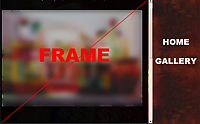
- Failure to Bookmark. I visit your home page which is the page hosting frame inside it. I click "Gallery" which loads the gallery page in the frame. I bookmark your page. What gets bookmarked? The home page, not the gallery, because that is the outermost HTML the browser finds. Although some browsers have gotten smart and are able to bookmark the specific frame, you'll find a lot of meta information, such as the page title, is missing as I briefly cover in SEO below.
- Printing the page is completely broken.
- Reloading the page will not reload the selected frame, it will reload the home page frame.
- Back and forward buttons seldom work as expected.
- Search engines will have difficulty indexing your site.
Additionally the usage of frames screams of 1995 technology, and we don't want that. :-)
Use Clear, Familiar Navigation >>
Another frequent flier I found in artist sites is the need to use creative descriptions for ordinary navigation devices and other tools. As I mentioned in web tricks above, people don't like it when you change the rules. They know how the web works and want to feel comfortable in your world. When building your site navigation don't call your gallery or portfolio "manifestations" or "creations" or any other words that demonstrate your creative spirit. Let your art do that!
People aren't stupid and they'll figure it out, but they may feel a little annoyed and perceive it as an attempt to throw them off, or wonder why you couldn't just call a circle a circle instead of a locus of points equidistant from a given point on any two-dimensional surface.
This includes what is called mystery meat navigation, and the example I am going to cite is also an example of Pages Prettier Than the Art, below. The artist home page opens on a photograph of a gallery of art, with several pieces on the wall. I sat there for a few seconds before I realized I was supposed to decipher the meanings of the paintings. By mousing over the paintings I could see that they led to the very ordinary links of Gallery, About, Contact. The web developer in me thought it was an interesting device, but as a visitor, I was a little annoyed that I was forced to figure it out when it should have been familiar and obvious.
Pages Prettier Than the Art >>
I touched on this briefly in the original article. When you are invited to show your work in a gallery, do you repaint the walls, request that murals be hung, move in new furniture because you want the environment to reflect your creative spirit? I'm going to guess no.
Never forget why your visitors are here: to see your art. Don't get so obsessed with the website design that you feel it has to reflect your creativity as an artist, otherwise that statement might outshine your work. The example above in clear, familiar language is a perfect manifestation of this. I was so distracted by deciphering the website I remember the website more than I do the artwork. The best artist sites I have seen do exactly this, sometimes to the extreme: plain, white website with nothing but simple navigation and the work.
If you Use Images to Represent, Make Them Link >>
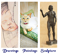
Another frequent flier is neglecting to link images when you should. In the example at the right, we have drawings, paintings, and sculpture, but only the words actually link to the gallery sections. Clicking/tapping the images gives the user the impression that something is broken. This gets back to the user's expectation of The Way the Web Works - don't redefine it for them.*
* There are a few accessibility/HTML5 rules relating to having the same links being to close to each other - this is a discussion for another day.
Circular Navigation/Make Sure Enlargements Enlarge >>
One of the worst aspects of web builder sites I encountered is a circular or non-functioning enlargement of images in the gallery. I navigate to gallery, see a thumbnail that looks interesting, click/tap on it to get a larger look, and only a slightly larger image appears. Still too small to get a feel for the artist's work. Mousing over the image indicates I can navigate further, so I attempt to do so. At that point, one of three things happens:
- I am dropped back on the initial gallery page with the thumbs.
- I am dropped onto the initial artwork page with the smaller image.
- Nothing.
In all cases, I expected to get a closeup, to see the brush strokes and washes, and was denied. I understand that many artists avoid larger images out of fear someone is going to steal their work (and that does happen,) but this should not reflect in a navigation scheme that frustrates your users. It's a risk we all take, one I at least partially solve with watermarks.
Mobile Compatibility >>
One of the things that shouldn't surprise you is that almost 70 percent of Facebook users access Facebook via mobile. You can guess that web page visits are also approaching similar numbers, and mobile compatibility for your site is critical.
Most people I discuss this with tell me they've been to their sites on mobile and all they have to do is tap-enlarge the screen.
And swipe back and forth sideways to read long lines.
And find other ways to navigate because there is no mouseover event on mobile devices.
The issue of being mobile compatible is far larger than the size of the screen or how it looks, it's about the users' ability to access and buy your products using their mobile devices. This is too large of a topic to discuss here, but artists need to consider it well when building their web sites.
Does Google think your site is mobile friendly?
Source Code is MORE than Just SEO >>
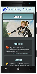
I mentioned in Don't Disable Right Click above that I often view source of the page to see the technology it's built on, but there are other things I look for as well, things you can see without knowing what all that gobblety-gook means. In the image at the right, I have my home page open in one tab and a very typical artist home page open in another. The words you see there are a result of the <title> tag in the source code of the page. In any discussion of source code the conversation inevitably turns to search engines and keywords and all that stuff, and every word is true, but there's more to it.
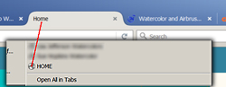
When a visitor bookmarks the page that has HOME in the title, guess what gets bookmarked? The bottom right image: HOME. So a week or so later that potential buyer is digging through their bookmarks because they found the perfect spot for the piece of art they saw on your site and can't find it because they probably have a lot of bookmarks with HOME in the title.
Bookmarking the home page on this site would read "Watercolor and Airbrush Artwork | Scribblings 'N Stuff."
While the topic is SEO, there are a lot of usability issues that a consultation with an SEO consultant can fix. It can be expensive, but there is a LOT you can do on your own or with a small investment.
After all, you are investing in your most valuable asset: you.
It may seem like a lot of hassle to deal with, but the most important thing is you present yourself in a professional light and make it as easy as possible for buyers to connect with you. Anything you invest in that venture is worth every penny.
Categories: About the Art • Observations
Add a Comment